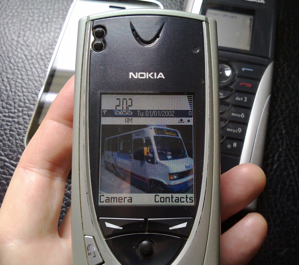
The Nokia 7650 and the first Symbian 'homescreen', back in 2002.... where it all went wrong? Or where it all started to make sense? The jury's out!
Let's think back. Way back in the Symbian family tree, looking at the 'home' interface presented:
- Psion Series 3 (Symbian's oldest living dead ancestor): a strip of applications, with associated documents listed below.
- Psion Series 5/EPOC: a folder system, i.e. documents, with a pop-up panel of installed and extra applications, when needed.
- Nokia 9210: a hierarchical grid of application launching icons (predating Series 60), with a side panel of status icons.
- Nokia 7650 (first Series 60): the appearance of a proper 'homescreen', arguably, called the 'standby' screen here, with a picture of your choice, network, time and data status (etc) plus two application shortcuts on the left/right function keys. A 'Menu' key pops up a hierarchical grid of application launching icons.
- Sony Ericsson P800 (first UIQ): lists or grids of application shortcuts, according to preference, some folders used.
- Nokia 5800 (first touchscreen S60): a mix of app shortcuts and status icons, with the standard S60 app grids available on a screen tap or physical button push.
- Nokia N97 (first with homescreen widgets): defined slots on the homescreen for 'widgets', with either active or passive content, with the standard S60 grids a button press away, as on the 5800.
- Nokia N8 (first multi-touch, modern Symbian device): three swipeable homescreens, each with the six slots, so 18 widget slots in all, plus status icons on each, and with the S60 grids a button press away, again.
- Nokia 701 (first out-of-the-box Symbian Belle device): six swipeable homescreens, now with variable sized widgets and custom layouts, a button press gives (by default) a flat, scrolling list of applications.
Along with the Symbian timeline, a few more data points might be relevant:
- Apple iPhone: no homescreen as such, just multiple pages of application shortcuts. A deeply flawed model in theory, since everything's app-centric rather than task-centric, but hey, it's sold in its millions and people seem to like it(!)
- Samsung Galaxy S (or any other modern Android phone): up to 7 (or even, in extreme cases, 9 or 11) homescreens of irregular widgets and shortcuts, with pages (or a scrolling list) of application shortcuts a button press (or screen tap) away.
I have to confess to doubts as soon as the 'standby' screen appeared in the first place, for the Nokia 7650 and then in more polished form for the likes of the 6680, the forerunner of three years of T9-based S60 handsets with similar front end. After all, while it was nice to see a pretty picture, it was one step away from actually doing 'stuff'. As the standby screen sprouted extra shortcuts (and eventually morphed into widgetised homescreens), the amount of 'stuff' you could do without actually needing the application grid grew and grew.
And so we have the paradoxical situation today, where most people's Symbian (or Android) smartphones have most commonly used functions on multiple homescreens and there's virtually no use of the pop-up application grid - while, on the other side of the ecosystem world, we have the Apple iPhone sticking rigidly to the 'just grids and folders of application icons', with not a 'homescreen' in sight. In fact, the iPhone's way of working in this regard isn't a million miles away from the Nokia 9210 from twelve years ago. Ironic, huh?
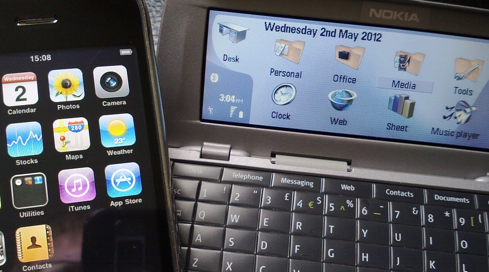
The iPhone and Nokia 9500 (a polished version of the original 9210) - similar ways of working the 'home' UI?
All of which proves that there's no one right way of doing smartphone interfaces but that, if you're going to go down a particular path (i.e. homescreens or app grids) then do it wholeheartedly and not have some mish-mash compromise.
But I digress, let's keep this Symbian-only in order to make a point I've made before, but hopefully even more emphatically. Quoting from my own 'Sometimes simple is best' piece:
My problem is this - the whole concept of a homescreen was that it would be your 'home'. The one place where everything you really needed to know was gathered. Not a starting place for swiping backwards and forwards multiple times, trying to find the piece of information you're after - you might as well just dive into the main menu and go to the appropriate application.
I've been trying to like the Symbian^3 triplet of homescreens and have utterly failed. I've tried spreading the widgets out, I've tried 'theming' them ('Telephony stuff', 'Internet stuff', 'Media bits', etc) and I've tried prioritising them ('Really important bits', 'Less important bits'...) and so on, to no avail. I'm obviously a simpleton because I've found I function best when there's just one homescreen, one place to glance, one place to land up every single time.
Widgets and icons on other homescreens tend to just get forgotten - in the buzz and busyness of life, I literally don't remember that the other homescreens are there - apart from when I want something that I know they contain and then it's an irritation to have to swipe left - or right - and then find the thing I wanted was on the 'other' (third) homescreen after all.
An issue which is now twice as bad, since there are a possible six homescreens, plus some of the small widgets I used to use are now larger (i.e. double height), which means that even I can't fit all my 'stuff' on the one homescreen anymore. As a result I have a single, main 'home' homescreen, with email, weather and my four most used applications (Podcatcher, Micropool, Handy Safe Pro and Gravity), plus a 'people' homescreen off to one side, with contact shortcuts to family members, my Calendar and a nice wallpaper of a recent addition to the extended family. It's not ideal, but it'll do.
But, as just explained, the whole system is something of a mess. My solution is, obviously, to try and keep to the one 'home' homescreen as far as possible, relying on neatly organised applications in the main popup application grids for getting to most of the phone's functionality. But others end up with using most of the six possible homescreens, with widgets scattered almost at random 'just because they're there' - the end result is that functions are spread pretty thinly, it's a hassle getting to them all, and chances are that the user will have to keep dipping into the Symbian app grid/pane anyway. So we have two tiers of main UI, usually duplicating and overlapping to a heavy degree.
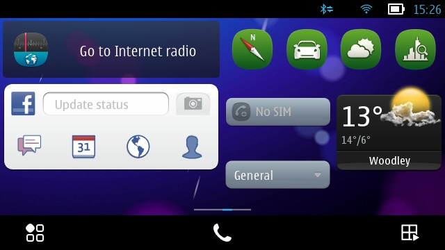
A typically messy Symbian homescreen - no order. And note the bottom-of-screen indicator - this is one screen of six along similar lines!
As I say, this is an issue that Symbian shares with Android and there's no perfect solution - and hasn't been ever since 'Series 60' (as it was then) opened Pandora's Box and introduced this extra UI layer (the standby screen) all those years ago.
In opposition to my way of working my N8 and E6, there's also the school of thought which will put a lot of effort into perfectly maximising the six available homescreens, making sure that every app needed is there somewhere, even 'theming' each screen along typical lines, e.g. 'Email and comms', 'Games', 'Personal and family', 'Web and cloud', and so on, meaning that there really isn't a need to go into the Symbian app grid in normal use. Which is fine, it's an equally valid way of working - but it does mean that they can't then really talk about their homescreen - singular - because, as the title of this (increasingly rambling) editorial suggests, the entire concept is a plurality!
In summary:
- find a way of working that suits you
- keep it as simple as possible
- optimise it as far as possible
Or we could all go back to a Nokia 9210/iPhone way of working, picking our way between applications as needed?
What do you think? Do we need to go all-homescreens or all-app-grids? Or do you do as I've done and try to work out an optimal middle ground strategy?
Steve Litchfield, All About Symbian, 3 May 2012