Welcome!
Today’s post is going to be a super basic Gimp lesson. I’ll be editing the same bear that I used for the Photoshop post. There are some differences between the programs. I’ll point out my opinions of them along the way. The end result looks the exact same.
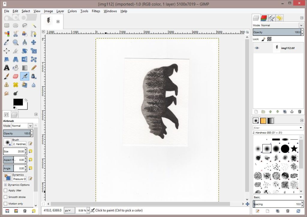
Picture is scanned, and I open it in Gimp.
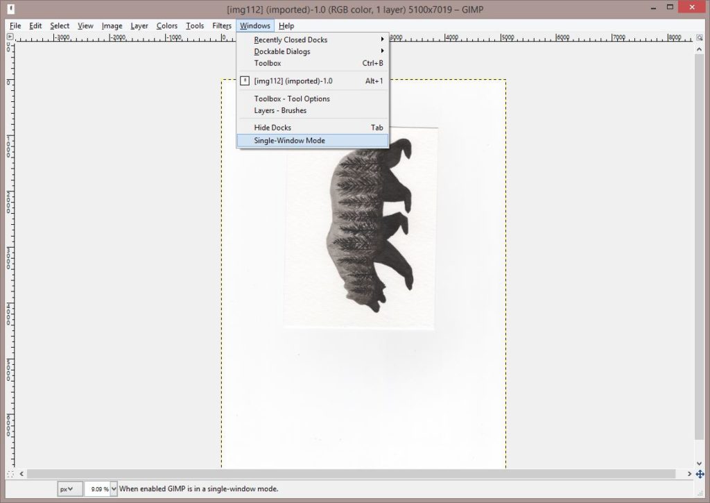
Gimp has a couple of options for the screen layout. If you open your file and it doesn’t have the side tool bars, go to the windows tab at the top. Where it says Toolbox- Tool Options, that is the screen on the left above, and the Layers-Brushes is the box to the right on my screen above. Normally I would work with these as separate windows out of personal preference, but because I had to take screenshots it was easier for me to click Single-Window Mode. So if your screen looks like the one below and you have separate windows for the tools that’s why.
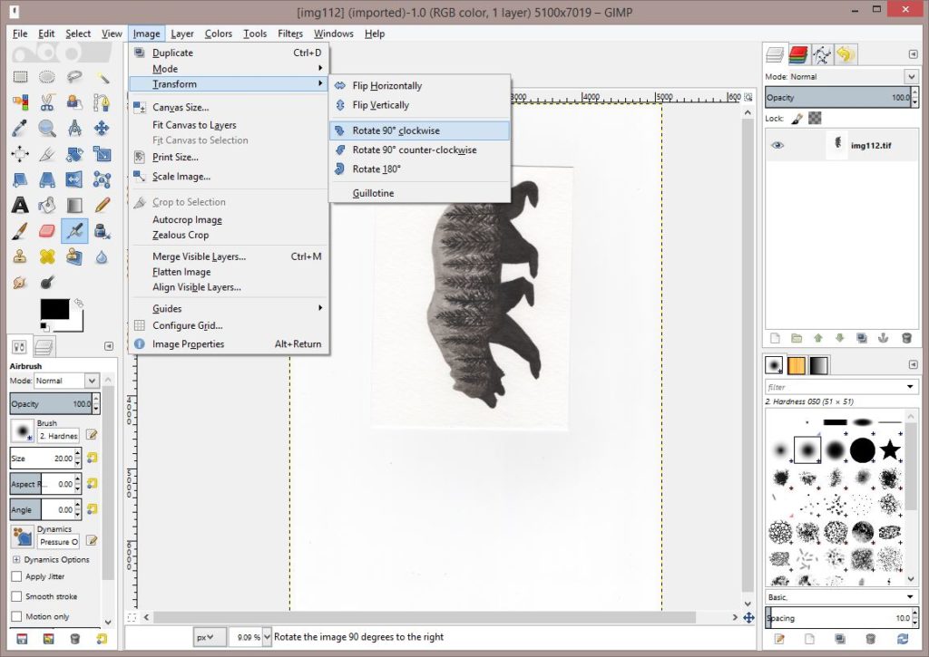
So first step is to rotate the image. Click the image tab at the top, then Transform, then rotate.
Then we’ll crop it. Click the rectangle select tool in the top left of your toolbox. Select around the area. The nice thing here about Gimp is that you can just adjust the selection using the boxes. Just drag them around until you get the right area in there.
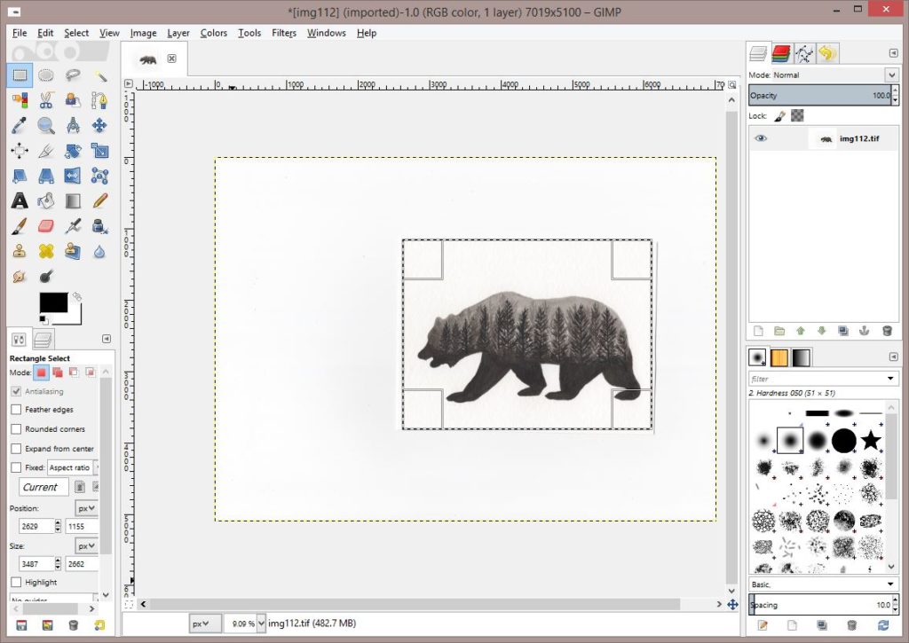
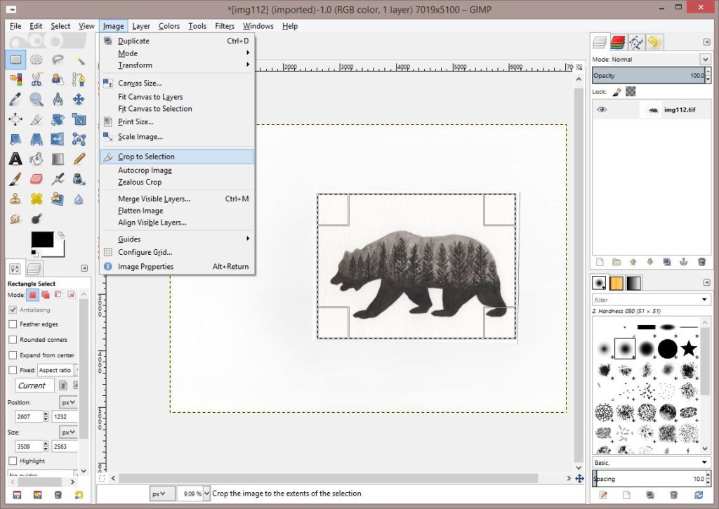
Once you’ve got that part ready go to the Image tab, and then Crop to Selection.
I’m going to adjust my zoom here by going to the View tab and then Zoom.
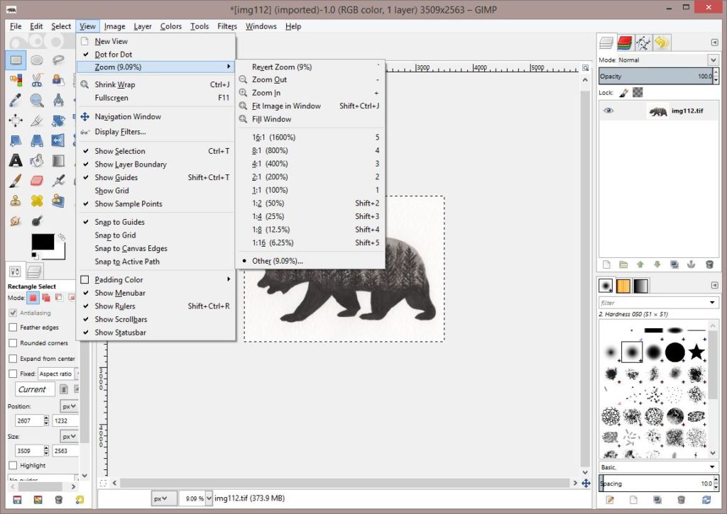
That’s better.
Here is where Photoshop has Gimp beat hands down. With Photoshop you add your adjustments in layers on top of the original. If you mess up, it’s very easy to just delete that adjustment and start over. Not so much with Gimp. So after every major adjustment I create a new layer. So to start, I’m going to copy my original. That way if I mess up, I can just restart with the cropped picture instead of having to redo the steps I’ve done so far.
Go to the Layer tab and Duplicate Layer.
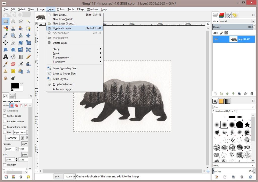
Here I renamed my original layer by double clicking. For this example it is pretty simple, but when you are editing a harder picture and have to make multiple adjustments, it’s very helpful to put in the layer name what that layer has had done to it.
I’m also going to hide this layer by unclicking the eye. Then I have to click on the layer I want to work with. Here the original hidden layer is highlighted in blue.
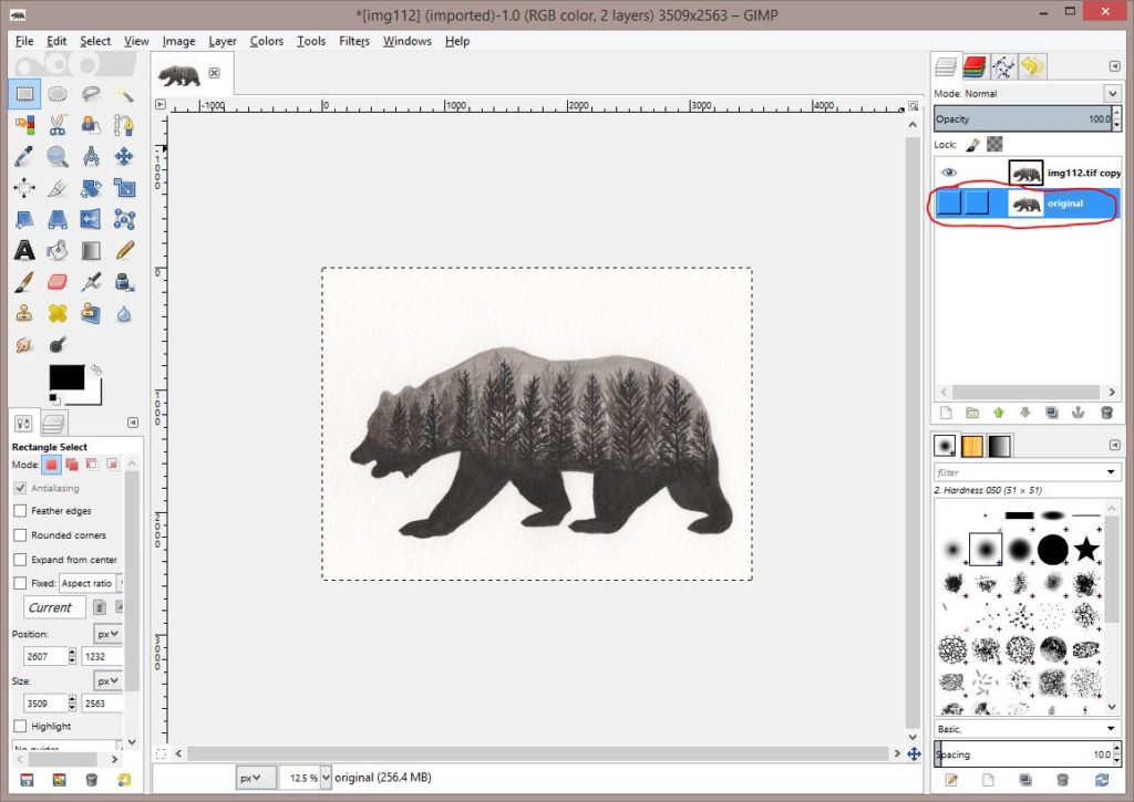
Now the layer I want to edit is highlighted. It’s important to make sure that you have the right layer highlighted. If you find yourself working and it seems like nothing is showing as adjustments this should be the first thing you check.
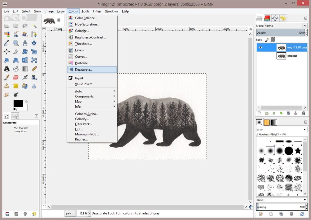
Next step is to desaturate. Click the Colors tab at the top, then Desaturate.
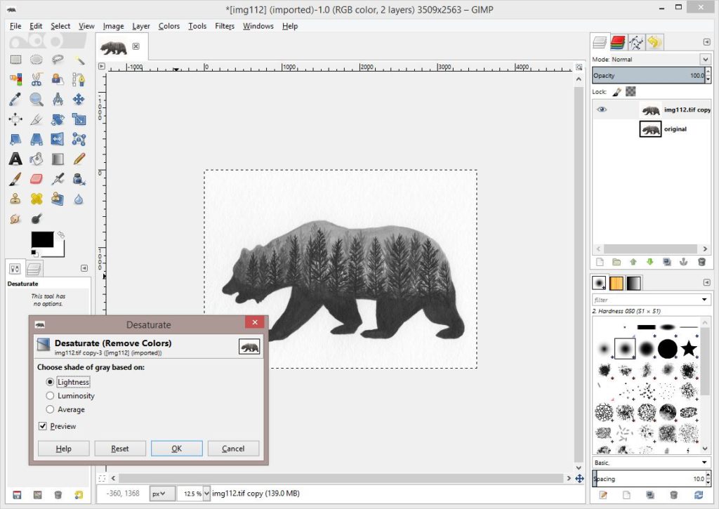
We have a couple of options for how the program will determine what we want. Normally I just leave it clicked on Lightness, but occasionally it looks better using either Luminosity or Average. The little Preview box that is check is showing you the changes. If you uncheck it, your original image will show. It’s often helpful to toggle back and forth to test out the changes it’s making.
I’ll click OK.
Now we need to get our paper to white and our blacks to show blacker. There are a couple of different ways to do this in Gimp. I’ll demonstrate both. We can go to the Colors tab and then click Levels.
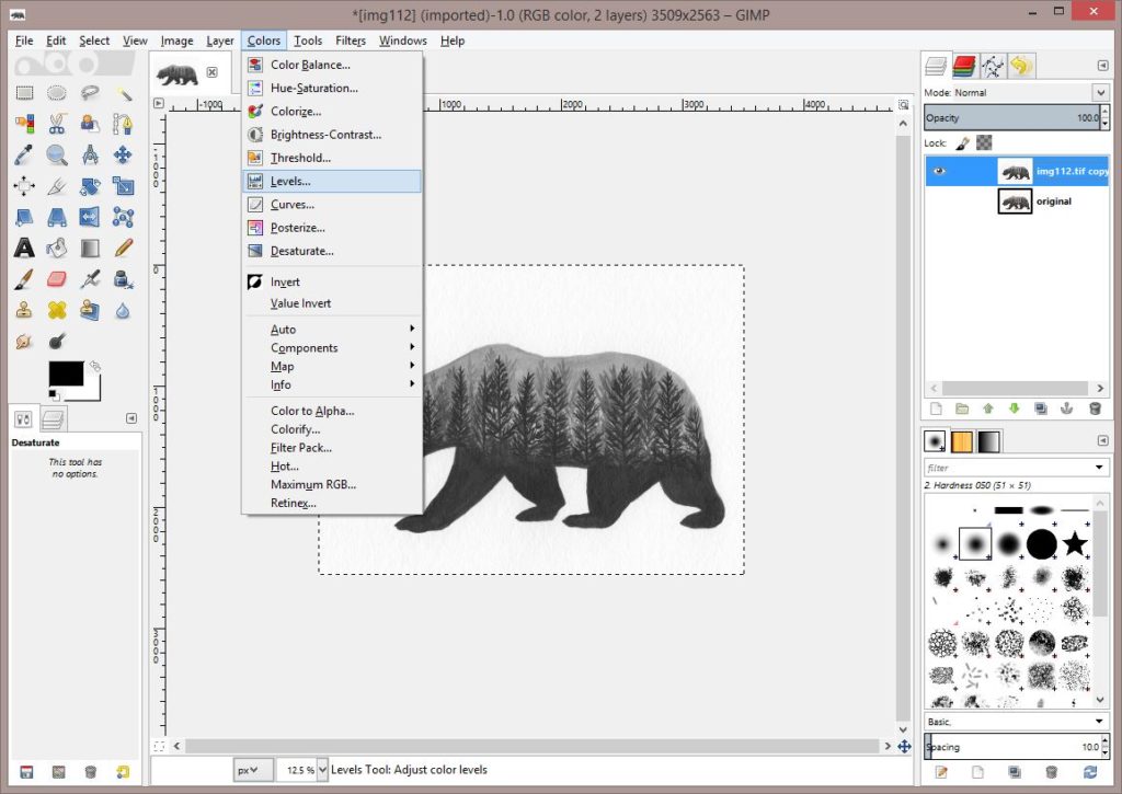
Here the screen looks very similar to the Levels in Photoshop. They can be adjusted the same way. Pull the left triangle to the right until your blacks match, and the right triangle to the left until your whites match.
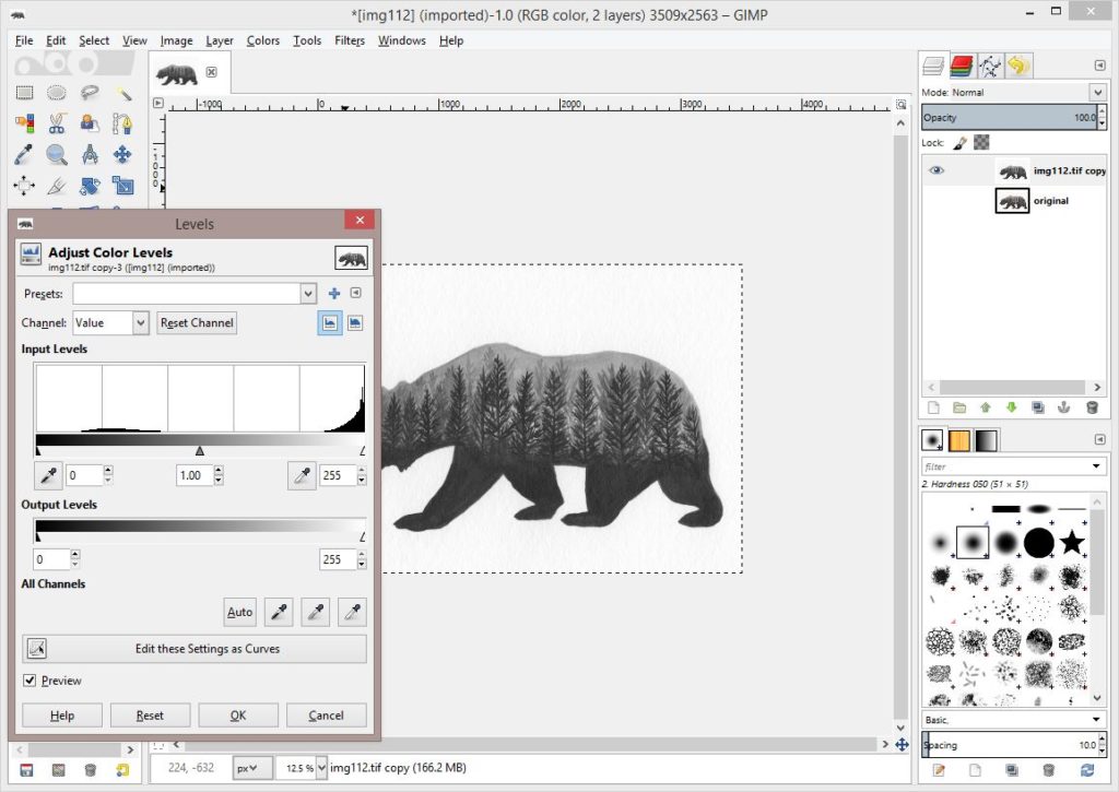
I have adjusted mine. Sometimes you need to adjust a bit more. You can click from this screen to Edit as Curves.
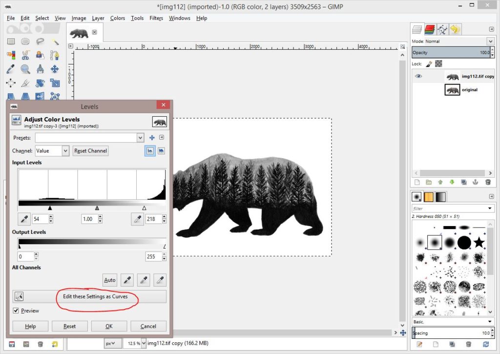
Here our Curves screen shows two lines. The original line and then our adjusted points that have carried over from the Levels. The arrows are pointing to the changes we made. This screen is a grid. If you look at the numbers from the Levels screen our white point is now 218, that is the coordinate at top, our black point is 54 and it is along the bottom. This can be helpful as edits get more difficult, so for now just store that in the back of your mind.
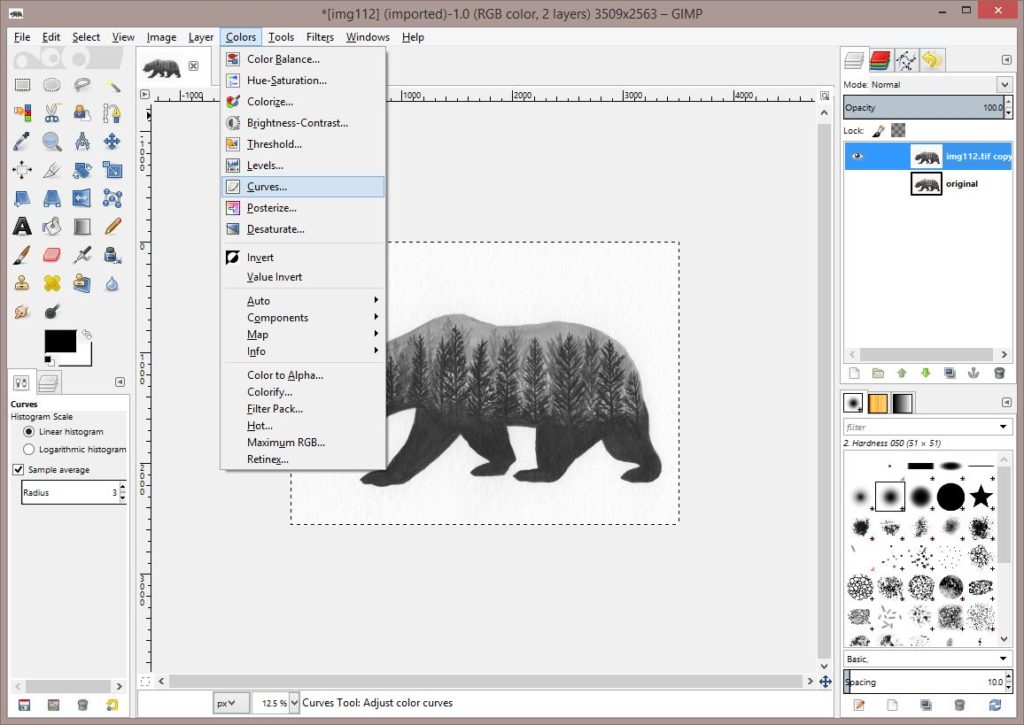
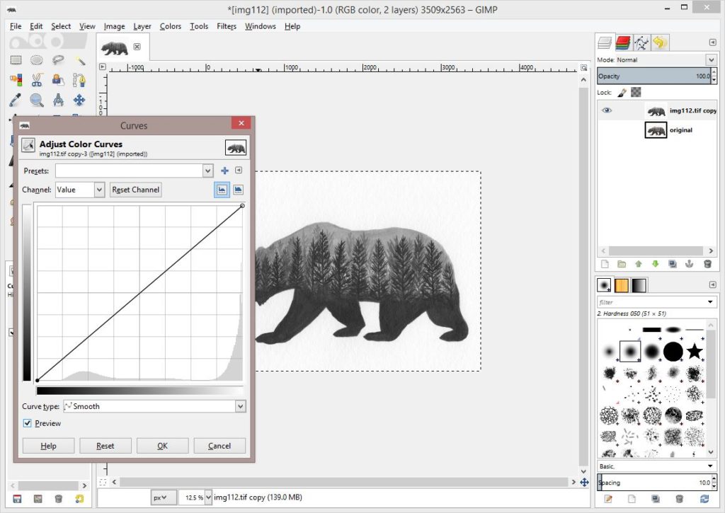
We can also just start from the beginning and use the curves to start with. From the Colors tab, we go to Curves.
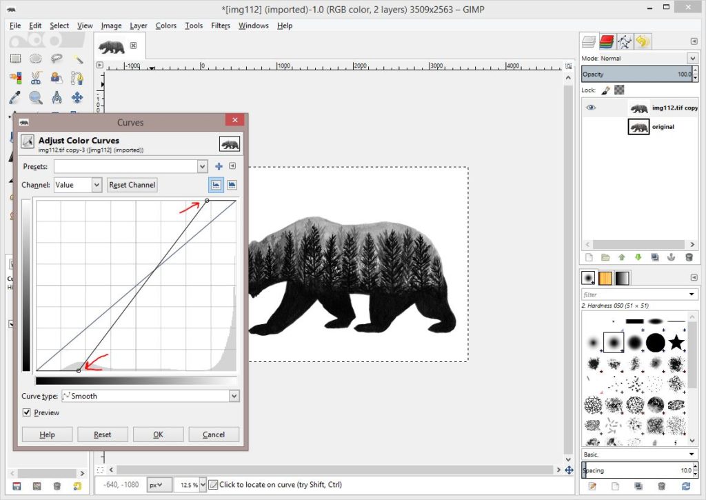
Here I will click the circle at the top right and pull it left until I feel my whites are good. Then I’ll click the bottom left circle, pulling it to the right until my blacks look good.
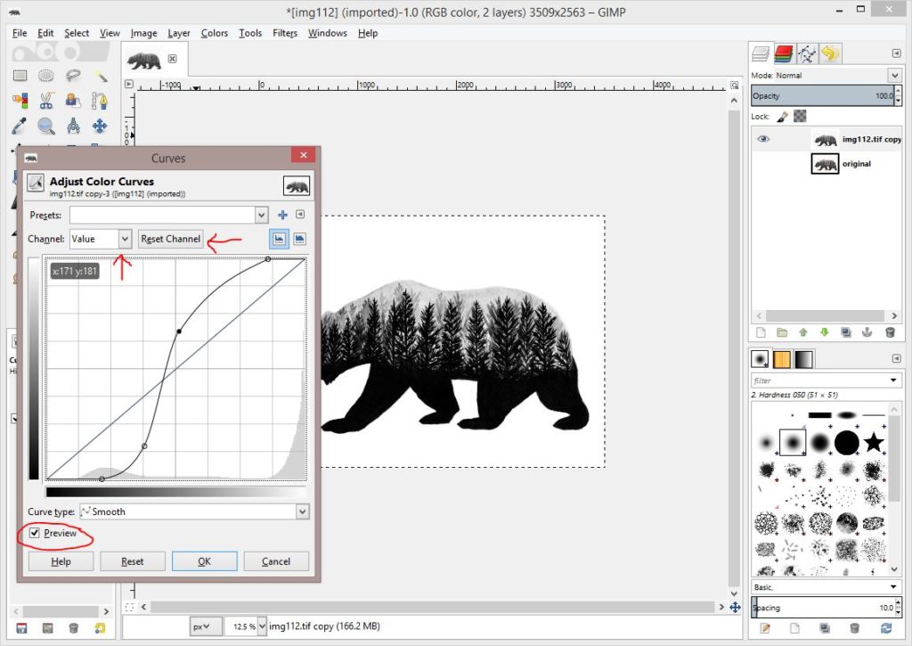
My line actually looks the same as it did when I clicked through the levels, but here I’m going to show you one of the cool things about Gimp. I can click on any parts of this line to adjust. Below my line has turned into a curve. Notice that I have much less of a range of colors in this photo. I’ve added the point close to the bottom and pulled it darker so that trees that were sort of dark before are now very dark. And I added a point closer to the top and pulled it lighter so that the background is now much lighter.
A thing to remember, everything above the diagonal line will make your values lighter, and below will make it darker. Pull a point up if you need lighter, down for darker.
A couple of side notes here. Where I have an arrow pointing to Value, there is a drop down here where you can change different color channels. If this were in color, I may need to change specific colors. I can also hit the Reset Channel if I want to go back to the original. And then there is the preview box that I can click and unclick to see how it’s changing my photo.
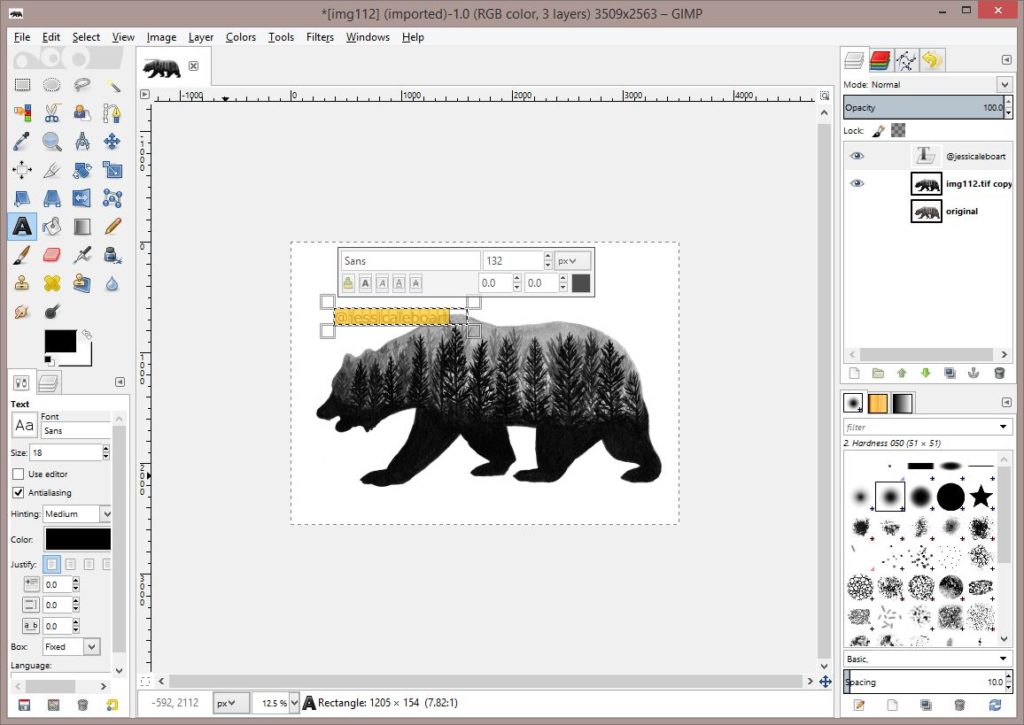
Next I’m going to add a watermark. Click on the text tool, which is the A on the left toolbar. I type my name.
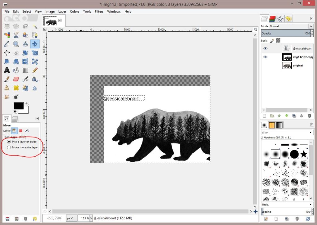
Then I have to click off of the text tool and click the move tool. I’ve circled them both in red.
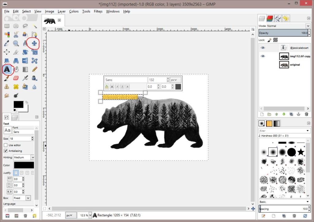
I want to move the text. I click and drag, but oops! I get this. It thinks I’m trying to move the bear. So I need to click pick a layer, then make sure my text layer is highlighted on the right.
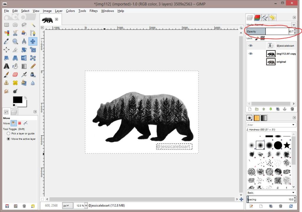
Now I have the text where I want it. I’m going to adjust the opacity again, just like I did with my Photoshop version. You could just change the color here, but I find this method to work just fine.
Then we’ll save. (Or you could be smart and save your image as the first step.) I go to file then Save As.
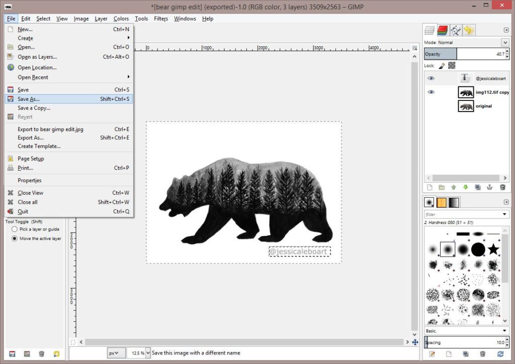
I name and save my image.

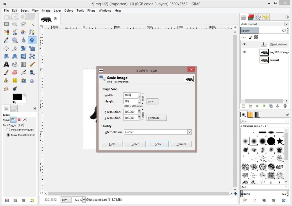
Then I want to save it so that I can post it to Instagram. (I’ve actually already posted it, but this is how I’d go about that!) So I need to resize the photo. I go to the Image tab and Scale Image.
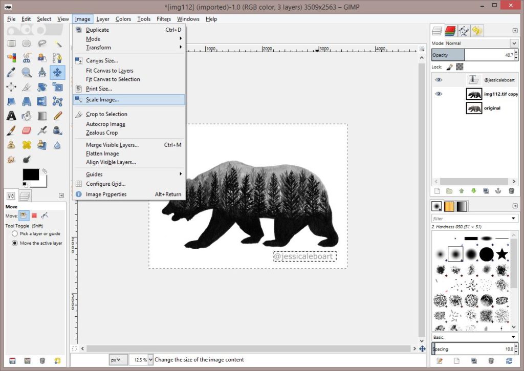
My original dimensions look like this.

I change my resolution from 600 where I scanned it at to 300. Then the recommended max pixels for Instagram is 1080 so I change my largest dimension to 1080 and the other adjusts accordingly.
Then I have to get my file saved as a jpeg. I go to the File tab and then Export As. This differs from Photoshop where I save it as a jpeg. Here we export.
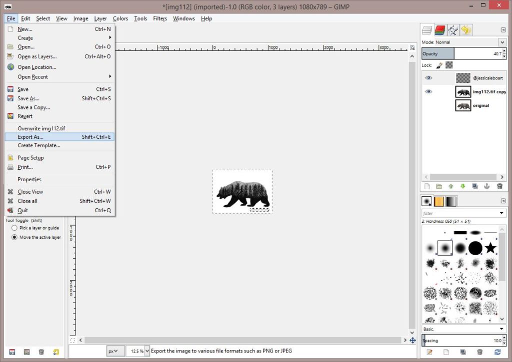
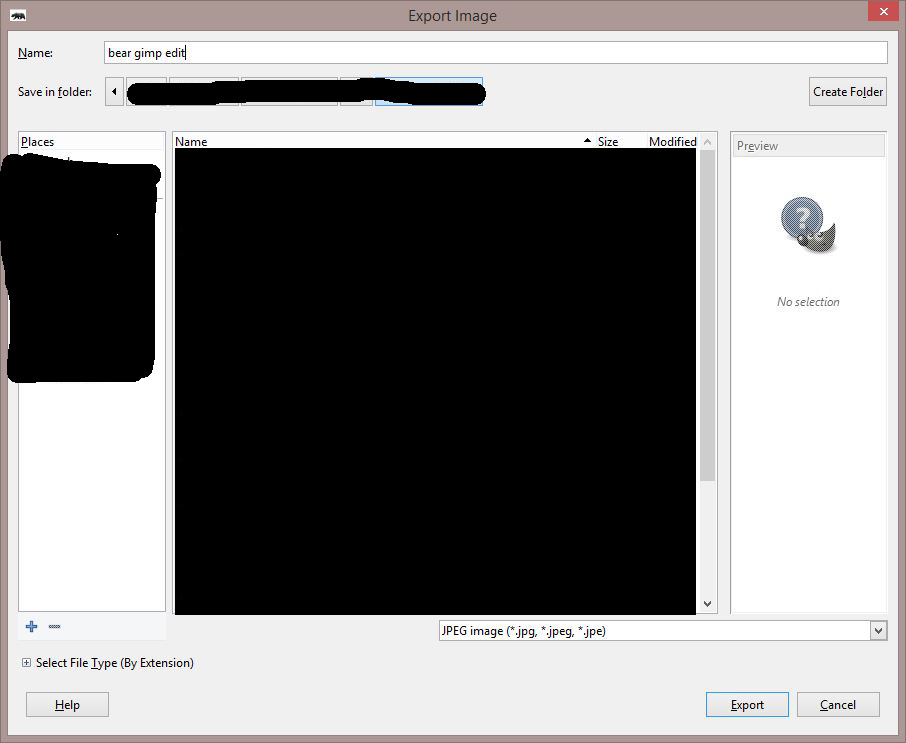
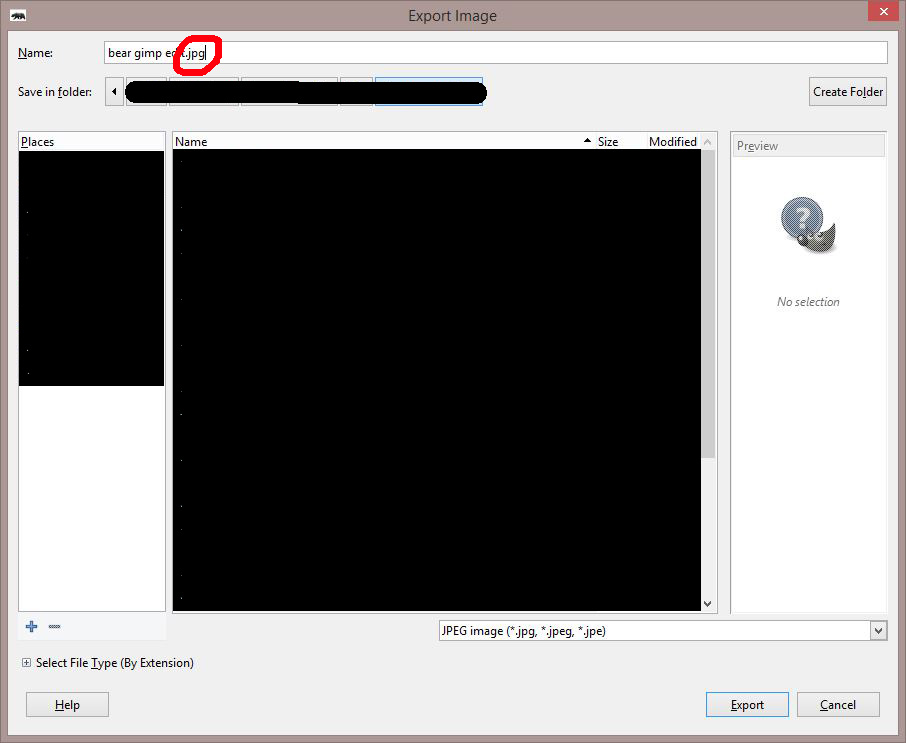
I change my file name and choose JPEG from the drop down below. Then click Export.
What?! I messed up. When I typed in the file name to save it, the extension automatically deleted. I have to go add the .jpg to the file name.
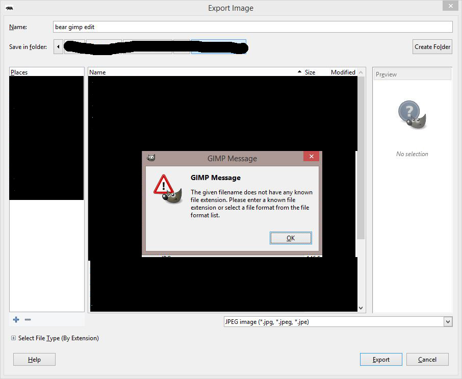
I just type “.jpg” in there. Now I’m ready to hit Export.
And we’re done! I have my double exposure bear edited with Gimp. For free!!

And here is the same thing edited with Photoshop.
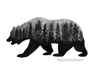
Hmmm, no difference?!?! Actually there is! I use a nicer font in Photoshop. But that’s it. 😉
Hope you found this helpful. Like I’ve said, this is a very very basic edit. You can use these same steps to edit any other photo. It will make a huge difference to most photos, even colored ones. Play around and test it out. You may run into some additional issues and I’ll be working on a few scenarios where we have to do a bit more. If there is a specific issue you’d like me to address in basic steps like this, please feel free to let me know!
Have a wonderful day!