sesc pompeia, 2016
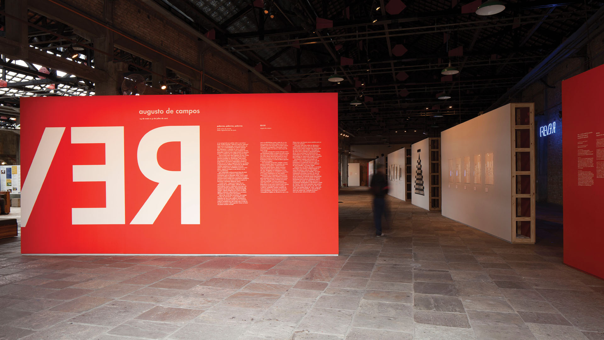
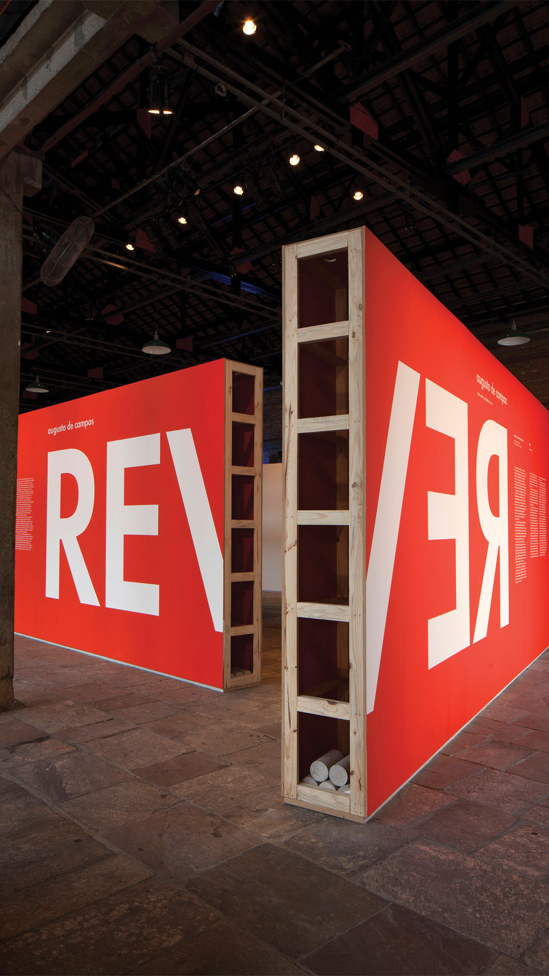
it was in the ‘futura’ typography that concrete poets, in the early 1950s, spelled out most of their visual poems. in ‘rever’, an exhibition that pays homage to the production of augusto de campos, a key figure in this movement, it could not be another font.
from the poems to the works’ subtitles, through the brand, promotional materials and catalog, it is futura that gives form to the visual identity and environmental graphics. in this project, we used an updated version of the font, the ‘futura nd’, distributed by bauer types and redesigned from paul renner’s original matrices.

curated by daniel rangel, exhibition design by alvaro razuk and exhibition photos by ricardo amado. awarded project by the society of typographic arts, chicago.